Home » Guides » Arches of Identity: Unraveling the Design Story of McDonald’s Golden Arches
Arches of Identity: Unraveling the Design Story of McDonald’s Golden Arches
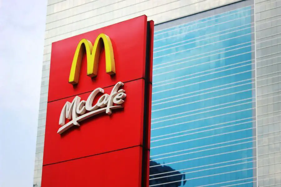
The Golden Arches, the emblematic logo of McDonald’s, is arguably one of the most recognizable symbols in the world. It’s a testament to the power of branding, design, and cultural resonance. This article explores the story behind the Golden Arches, tracing their evolution from architectural elements to a global symbol of fast food.
The Beginning: The First McDonald’s and Its Architecture
The McDonald’s story began in 1940 when Richard and Maurice McDonald opened their first restaurant in San Bernardino, California1. The brothers’ innovative “Speedee Service System,” which would later become the model for modern fast-food operations, was accompanied by an equally distinctive architecture.
The original restaurant featured arch-shaped parabolas on each side, designed to be seen from the road and attract customers2. Architect Stanley Clark Meston conceptualized these arches, which were not initially intended to form an ‘M’ but were merely a distinctive architectural feature3.
Emergence of the Golden Arches: From Architecture to Logo
The transformation of the architectural arches into the Golden Arches logo we recognize today began in the early 1950s. When the McDonald brothers decided to franchise their business, they understood the importance of creating a distinctive, recognizable identity for their restaurants.
Richard McDonald sketched the initial design of the Golden Arches logo, inspired by the arches of their restaurant buildings4. However, it was Jim Schindler, the head of engineering and design at McDonald’s, who finalized the design, incorporating the two golden arches with a slanted line running through them representing the restaurant’s roof5.
The Evolution of a Symbol: McDonald’s Logo Through the Years
Over the years, the McDonald’s logo underwent several transformations. In the 1960s, the stylized restaurant image was dropped, and the arches were merged to form a standalone ‘M’6. This simplified logo, designed by prominent graphic designer Lou Dorfsman, proved more effective and easier to recognize.
In the 1970s, the Golden Arches were placed within a red square, with the “McDonald’s” name displayed prominently below7. This version of the logo, with minor variations, is still in use today.
Simplicity and Significance: The Genius of McDonald’s Logo Design
The genius behind the McDonald’s logo design lies in its simplicity and significance. The Golden Arches are immediately recognizable, conveying the brand’s identity effectively without the need for words. The design’s simplicity allows for its reproduction at various scales, from towering restaurant signs to small promotional materials, ensuring consistent branding.
The logo’s golden color was chosen to symbolize warmth, happiness, and positivity, aligning with the brand’s mission to create moments of joy for its customers8. The boldness of the color also enhances visibility, serving a practical purpose in attracting attention.
Branding Beyond Burgers: The Golden Arches as a Cultural Icon
Beyond its function as a brand identifier, the Golden Arches have transcended into cultural iconography. The logo has been referenced and parodied in numerous forms of media, from films to artworks, signifying its penetration into popular consciousness.
The Golden Arches have also become symbolic of American culture and capitalism, often used to represent the spread of American influence globally9. It’s a testament to the logo’s power that it can evoke such associations, underlining the role of design in shaping cultural narratives.
From Inspiration to Icon: Tracing the Roots of the Golden Arches
The roots of the Golden Arches can be traced back to the original architectural design of the first McDonald’s restaurants. The arches were initially a practical solution, designed to make the buildings stand out. However, their adaptation into a logo marked the beginning of a new era for McDonald’s, as the company began to understand the power of branding and visual identity.
The Impact of Design: How McDonald’s Logo Reflects its Brand Values
The McDonald’s logo is not just a visual identifier; it also communicates the brand’s values. The Golden Arches symbolize the company’s commitment to providing quality food quickly and consistently, wherever in the world you may find a McDonald’s.
The arches’ resilience, remaining largely unchanged for over half a century, mirrors McDonald’s own longevity and consistency. It reassures customers that wherever they see the Golden Arches, they can expect the same familiar menu and service quality.
Cultural Iconography: McDonald’s Golden Arches and Global Recognition
Today, the Golden Arches are recognized worldwide, a symbol that needs no introduction. They represent more than just a fast-food chain; they’re symbolic of American culture, global capitalism, and the power of branding.
Despite the controversies and criticisms that McDonald’s has faced over the years, the power of its logo remains unchallenged. The Golden Arches continue to stand tall, a testament to the enduring appeal of McDonald’s and the lasting impact of effective design.
In conclusion, the story behind the Golden Arches is a fascinating exploration of design, branding, and cultural resonance. It’s a testament to the power of a simple yet distinctive logo in creating a globally recognized brand. As McDonald’s continues to serve billions of customers worldwide, the Golden Arches will undoubtedly continue to shine bright, a beacon of familiarity in an ever-changing world.